
Brand Identity
Baby Earth Brand Identity
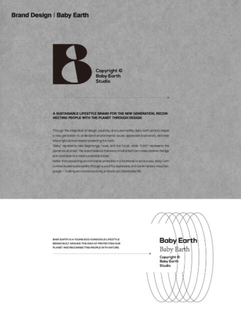
A geometric B anchors the identity, with alternate treatments of the Baby Earth wordmark.
- Client
- Baby Earth describes itself in the design materials as a lifestyle brand focused on sustainability.
- Project
- A geometric B anchors the identity. Alternate layouts explore how the symbol and Baby Earth wordmark can be paired.
Project artwork
Symbol and wordmark treatments